#react #typescript #frontend-engineering #debugging #css #state-management #api-design #caching #responsive-design #code-quality #junior-developer #software-architecture #requirements-engineering #testing
From Spec to Shipped: What Building One Feature Teaches About Software Engineering
2026-08-06 · 44 min read
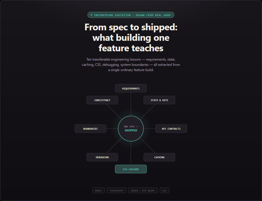
1. Requirements Gathering Is Itself an Engineering Skill
What it is. Before any code gets written, someone has to decide what the code should do. That sounds obvious, but "what it should do" is rarely fully specified up front — it usually arrives as a rough idea, a screenshot, or a partial description, and the gaps have to be filled in by asking questions, not by guessing.
Why it becomes a problem. A junior developer's instinct, understandably, is to start coding as soon as they have enough information to write something. The trouble is that "enough to write something" and "enough to write the right thing" are different bars. A feature built on a guessed-at assumption — "I assume closing this popup without submitting should just dismiss it silently" — might be perfectly reasonable code that does something the person who asked for it never wanted. The cost of that mistake is rarely caught immediately; it surfaces later, often after the feature has already shipped, as a confusing bug report that's actually a requirements gap wearing a bug's clothing.
Common beginner mistakes. The two failure modes tend to be opposite extremes. One is guessing silently and building on the guess, discovering the mismatch only when someone reviews the finished work. The other is asking too many questions, including ones that could be answered by just reading the existing code or thinking for thirty seconds — which trains the people around you to stop taking your questions seriously, or to feel like every task requires a meeting. Neither extreme is useful.
Better engineering approach. The useful middle ground is: resolve what you can from context and existing patterns in the codebase, and ask, specifically, about the parts that are genuinely ambiguous and consequential — decisions where guessing wrong would be expensive to undo, not decisions where either answer is basically fine. In the work behind this article, a request to build a confirmation-popup feature came with a fairly detailed spec covering the data shape and most of the behavior, but two genuinely open questions remained: what color scheme a button should use (the mockup showed one color, but the rest of the app's UI used a different one consistently), and whether closing versus submitting the popup should behave differently. Both were resolved by asking a direct, specific question with the tradeoff spelled out, rather than either guessing or writing a paragraph asking for a general review of "does this look okay." A short, targeted plan — laying out exactly what would be built, in what order, referencing the specific existing files and patterns it would follow — was also written and reviewed before any implementation code was touched, which is a separate habit worth calling out on its own: catching a misunderstanding in a plan costs a few minutes; catching the same misunderstanding after the code is written costs a rewrite.
How to recognize it early. Before writing the first line of implementation, try explaining the feature back in your own words, out loud or in writing, including the edge cases (what happens on error, what happens if the user cancels halfway through, what happens the second time this screen loads). If any part of that explanation makes you pause and think "I'm actually not sure," that's the exact thing worth clarifying before, not after, you write code around it.
Broader lesson. Good requirements-gathering isn't a soft skill bolted onto engineering — it's engineering. The goal isn't to ask permission for every decision; it's to correctly identify which decisions are cheap to make yourself and which ones are expensive to get wrong, and to spend your questions on the second category.
2. Component Identity vs. Data: The Real Meaning of a List "Key"
What it is. Modern UI frameworks like React don't redraw the entire screen from scratch every time something changes. Instead, they figure out what changed and update only that part — a process generally called rendering (calculating what the screen should look like) and reconciliation (comparing the new calculation against what's currently on screen to figure out the minimal set of changes needed). When you render a list of items, or the same component repeatedly with different data passed into it, the framework needs a way to answer a specific question: "is this the same logical thing as before, just with updated data, or is this a completely new thing that happens to look similar?" That answer comes from a key — a value you provide that acts like a name tag identifying which item this is, as opposed to where it currently sits.
Why it becomes a problem. If you don't provide a meaningful key, or if you provide one that's really just describing position (like an array index, or nothing at all, letting the framework fall back to prop values), the framework has no way to distinguish "this is a new logical item" from "this is the same item, please just refresh its display." In a feature built during this work — a popup that walks a user through several similar forms, one at a time, showing the next one once the current one is submitted or closed — the initial version rendered what looked like "a new form each time," but was structurally just the same component with new data passed into it as props. React, quite reasonably, treated it as the same component instance being updated, not a new one. The result: after finishing the first form and moving to the second, values the user had typed into the first form's fields were still sitting there, because the framework had reused the exact same underlying instance and never cleared its internal state.
Common beginner mistakes. The most common version of this mistake is treating "the data changed" and "this is a new item" as the same event, when they're not. It's also common to reach for the list index as a key by default because it's always available and always unique within that render — which is true, but position-based uniqueness isn't what you actually need; you need identity that survives the item being reordered, removed, or, as in this case, swapped out for the next item in a sequence.
Better engineering approach. The fix is to give the framework a key tied to the actual identity of what's being shown — in this case, a unique identifier belonging to the specific form being displayed, so that moving from form one to form two is a different key, which tells the framework explicitly: "throw away the old instance and its internal state, and mount a completely fresh one." The general principle extends past lists: any time a component holds its own internal state (a typed value, a toggle, an uploaded file, an error message) and the data driving that component can change to represent a genuinely different logical thing, the key needs to change too — otherwise old, stale state can silently survive into a context where it no longer makes sense.
How to recognize it early. A reliable warning sign: if a component has its own useState (or equivalent internal state) and it's rendered somewhere that its input data can change to represent a different real-world item — a different list entry, a different step in a sequence, a different record being edited — ask explicitly: "does this component get a key that changes when the underlying item changes?" If the answer is "no" or "I'm not sure," that's worth testing directly: change the data, and check whether anything typed or toggled from the previous state leaks through.
Broader lesson. A framework component isn't the same thing as the data flowing through it. Treating "same component function, new props" as automatically meaning "fresh state" is a subtle but common category error, and the fix — giving the framework an explicit signal about identity, not just content — is a pattern that shows up anywhere a system needs to distinguish "this changed" from "this is a different thing entirely."
3. Orchestrating Multiple Independent UI Elements
What it is. Real interfaces rarely have just one thing competing for the user's attention. A single screen can have several separate pieces of logic each independently deciding "should I show myself right now?" — a promotional banner, an update prompt, a form popup, a notification. Orchestration is the practice of making those independent decisions cooperate, rather than each one acting as if it's the only thing on the page.
Why it becomes a problem. Without any coordination, two auto-triggered elements can both decide to show themselves at the same moment, stacking on top of each other, confusing the user about which one they're supposed to interact with, or visually clashing regardless of which one happens to render "on top" in the page's markup. This is easy to miss during development, because when you're building and testing feature B, you're usually not simultaneously triggering feature A's exact conditions — the collision only shows up when both conditions genuinely overlap in a real user's session, which might not happen until the feature has already shipped.
Common beginner mistakes. A common instinct is to solve this reactively — noticing the collision after the fact (usually via a bug report or a screenshot) and then patching in a special case just for those two specific elements. A second, related mistake is over-solving it: building a fully general priority queue or z-index management system for a page that currently has exactly two things that might collide, which adds real complexity for a problem that doesn't yet exist at that scale.
Better engineering approach. In the feature built for this work, an existing auto-shown update/download prompt already appeared on the same dashboard screen the new form popup needed to appear on. Rather than letting both render independently, the update prompt was given a way to report "I am currently occupying the screen, or I am not" back up to a shared piece of state, and the new form popup was written to check that shared flag before rendering itself at all — so it simply waits until the first prompt has resolved (been dismissed, or determined it has nothing to show) before appearing. This is a proportionate, two-participant solution: not a general framework, just an explicit, minimal contract between the two things that actually needed to coordinate. The important discipline is documenting that contract clearly (in code comments, or written notes) so a third auto-triggered element added later doesn't get built in ignorance of the convention that already exists.
How to recognize it early. Before adding any new element that shows itself automatically (not from a user click, but from a condition being met on page load or data changing), check the same screen for anything else that already does the same thing. If something else does, ask explicitly: "what happens if both of our conditions become true at the same moment?" — and if the answer isn't obviously "nothing bad," that's the moment to add coordination, not after noticing the visual collision in production.
Broader lesson. Independent pieces of logic that each assume they're the only thing happening is a pattern that breaks the moment a second piece of logic with the same assumption gets added nearby. The fix doesn't have to be elaborate — a single shared flag, clearly documented, is often exactly proportionate — but it does have to exist deliberately, rather than being discovered by accident when two things collide on a user's screen.
4. Designing API Contracts and Validation Feedback Together
What it is. When a frontend and a backend communicate, they agree — explicitly or implicitly — on a contract: the shape of the request, the shape of the response, and what different outcomes (success, a specific kind of failure, a different kind of failure) look like in that shape. A well-designed contract makes it obvious, on the frontend, exactly what happened and what to do about it. A poorly designed one leaves the frontend guessing.
Why it becomes a problem. Some backend systems, for reasons rooted in how their infrastructure works, always respond with a generic "the request was processed" signal at the transport level, even when the meaningful answer is "processed, but the submission itself was invalid" — with that real answer nested one level deeper inside the response body. A frontend that only checks the outer, transport-level signal will treat a rejected submission as if it succeeded — showing a success message, or silently moving on, when the user's input was actually never accepted. Separately, when a submission genuinely is rejected, the backend might return a single error message describing what was wrong, and it's the frontend's job to decide whether that message belongs attached to one specific input field (so the user knows exactly what to fix) or displayed as a general message (because it isn't about any single field — the whole submission wasn't eligible, for instance).
Common beginner mistakes. A common shortcut is checking only the top-level "did this request succeed" signal and assuming that's the whole story, especially when the outer signal is the more obvious, more commonly documented one. A second common shortcut, on the error-display side, is showing every validation error the same way — always as a single generic banner, regardless of whether it's actually about one specific field — which forces the user to re-read their entire form hunting for the problem instead of looking directly at the field that's wrong.
Better engineering approach. The feature built here consumed a backend contract with exactly this two-layer shape: an outer signal indicating the network request itself succeeded, and a separate, nested signal indicating whether the submission was actually accepted, each independently checkable. The frontend code explicitly checked both, rather than assuming the outer signal told the whole story. For the error-display side, the eight or so possible rejection messages were sorted, deliberately, into two buckets before any UI was built: messages clearly about one specific field (an invalid year, an invalid roll number) got displayed directly under that field, and messages about the submission as a whole (no matching record found, this isn't currently eligible) got displayed as a general message near the top of the form. That mapping was written as a small, explicit lookup rather than a chain of scattered conditionals buried in the display logic, which makes it easy to see, at a glance, exactly which messages go where — and easy to extend later without hunting through rendering code.
How to recognize it early. When integrating with any API, deliberately trigger the failure case, not just the success case, and inspect the entire raw response — not just the field you expect to be relevant — before writing the code that consumes it. And before building error-display UI, sort every possible error message you know about into "belongs to a specific field" versus "doesn't" as a first step, rather than deciding case by case as you write the display code.
Broader lesson. An API response is a small piece of communication design, not just a data structure. Treating "did the request finish" and "did the thing the request represents actually succeed" as the same question is a mistake that specifically becomes invisible when a backend returns a technically-successful response for a logically-failed operation — which is exactly the situation where checking only the obvious, top-level signal costs the most.
5. Caching and the Question "Is This Data Still True?"
What it is. A cache is a stored copy of something you already fetched, kept around so the next time you need it, you don't have to fetch it again. Caching is one of the most reliably useful performance techniques in software — and also one of the most reliable sources of confusing bugs, because a cache only helps if the copy it's holding is still accurate, and knowing when a copy stops being accurate turns out to be a genuinely hard problem in general.
Why it becomes a problem. A tool like RTK Query (a data-fetching layer used in the frontend behind this work) keeps a cached copy of server responses so that navigating between screens doesn't always require a brand-new network request. That's usually exactly what you want. But some data specifically needs to be re-checked every single time a screen appears — a form-popup that only shows up under a certain condition (say, information the user hasn't submitted yet) needs to check that condition fresh on every visit to the relevant screen, not rely on what was true the last time it checked, because the whole point is reacting to a state that can change between visits.
Common beginner mistakes. The most common mistake is treating a caching library's default behavior as universally correct without examining whether this specific piece of data fits the assumption the default was designed around. A second, related mistake, once a stale-cache bug is noticed, is reaching for "just always refetch, everywhere, every time" as a blanket fix — which does solve the immediate bug, but trades away caching's whole benefit across the entire app, adding unnecessary network requests to screens where the cached data was perfectly fine to reuse.
Better engineering approach. The right fix is scoped to the specific data that actually needs it. In this case, the query behind the form popup was explicitly configured to refetch on every mount — every time that screen is visited — rather than trusting whatever was cached from a previous visit, because the entire feature only makes sense if it's checking current, not stale, information. Data that doesn't have that requirement (content that rarely changes, a list that's fine being a few minutes stale) was left on the library's normal caching behavior. The decision was made deliberately, per piece of data, based on what that specific data actually represents — not applied uniformly as an all-or-nothing setting across the whole app.
How to recognize it early. For any piece of fetched data, ask explicitly: "if this were slightly stale — showing what was true a minute ago instead of right now — would that actually cause a wrong user experience, or would it be harmless?" Data where staleness is harmless is safe to cache normally. Data where staleness would mean showing the user something actively wrong (an already-resolved prompt reappearing, or a resolved one failing to appear) needs an explicit freshness guarantee, not a default assumption.
Broader lesson. Caching isn't a setting you turn on or off for an entire application — it's a decision made per piece of data, based on how quickly that specific data can become wrong and how bad it is if the user sees the wrong version. The famous saying that cache invalidation is one of the genuinely hard problems in computing isn't hyperbole; it's a fair warning that "just cache everything" and "just refetch everything" are both wrong defaults, and the right answer requires actually thinking about each piece of data on its own terms.
6. CSS Custom Properties, Inheritance, and Why "It Should Just Work" Isn't Proof
What it is. A CSS custom property — often called a CSS variable, written like --some-name and referenced elsewhere with var(--some-name) — lets you define a value once and reuse it across many style rules, similar to a named constant in a programming language. Unlike a constant in most languages, though, a CSS custom property's value can be redefined differently for different parts of the page, and — critically — that redefined value flows down through inheritance: any element without its own explicit value for that property picks up whatever value the nearest ancestor above it has set, the same way a family trait passes down a family tree unless a specific descendant has their own distinct version of it.
Why it becomes a problem. This project's dark-mode theming used exactly this pattern: a custom property representing a border color, redefined to a different value depending on whether "dark mode" was active. A specific bug appeared only in one narrow combination of conditions: dark mode active, and running inside an embedded native-app context (as opposed to a normal browser). Investigating it initially pointed toward CSS specificity — the rules browsers use to decide which of several competing style declarations "wins" when more than one applies to the same element, roughly: a rule naming two conditions generally beats a rule naming only one. That theory was directly checked and confirmed accurate — the more specific rule genuinely was winning, exactly as expected — and the color it produced was still wrong. The real cause turned out to be one level removed: two separate pieces of code, written independently, applied two related-but-different marker classes ("dark mode" and "in the app") to different elements — one marker landed only on the outermost page element, the other landed on both the outermost element and its direct child. The rule setting the correct dark-mode value required both markers on the same element, which matched correctly on the outer element — but on the inner child, which only carried one of the two markers, a different, plain rule matched instead and quietly reset the value back to its light-mode version, right there, silently overriding what had been correctly inherited from above.
Common beginner mistakes. The most natural mistake here is stopping the investigation at the first plausible-looking theory — in this case, specificity — and, having found a rule that seems structurally responsible, assuming that's the whole explanation without actually measuring what value is being used at runtime. A second, related mistake is treating CSS inheritance as a one-way, one-time "value flows down and stays" mechanism, when it's actually recalculated at every single element: any element with its own matching rule for that property gets to override what it would otherwise have inherited, and that override can happen at any point in the tree, not just at the very top where the "main" definition lives.
Better engineering approach. The bug wasn't confirmed by re-reading the CSS more carefully — it was confirmed by measuring the actual, computed value of the custom property directly on each relevant element, in a real running instance of the page, which showed the outer element correctly holding the dark-mode value and the inner element incorrectly holding the light-mode one. A minimal, isolated reproduction — stripping away everything from the real application except the specific handful of rules and class names involved — was then built separately and confirmed the exact same behavior, which ruled out any other part of the real page being an unaccounted-for factor. Only once the actual mechanism was pinned down this precisely was a fix applied: broadening the rule so it also matches when the "dark mode" marker is present on an ancestor, not only when both markers land on the exact same element — matching how the underlying styling framework's own built-in dark-mode rules are written for exactly this reason. The fix was then verified the same way the bug was found: by measuring the computed value again afterward, not by assuming the corrected rule would obviously work.
How to recognize it early. When a themed or conditional style looks wrong in one specific combination of conditions but correct in every other combination, resist stopping at the first rule that visibly controls the broken property. Check what value that rule actually depends on, and specifically check whether that value is computed consistently everywhere it's used — including at every intermediate point between where it's defined and where it's consumed, not just at the two endpoints. And treat "I re-read the code and it looks correct" as a hypothesis, not a conclusion — the specificity theory here looked entirely correct on paper and was still wrong.
Broader lesson. Inheritance-based systems — CSS custom properties, but also configuration cascades, prototype chains, and any other "a value flows down unless overridden" mechanism — can be silently overridden at any point along the chain, not just at the origin. When two pieces of state that are supposed to travel together (here, two marker classes meant to represent "dark mode" and "in the app") get applied to different scopes by different, independently-written pieces of code, the resulting inconsistency can surface far away from either piece of code, in a rule that, read in isolation, looks completely correct.
7. Systematic Debugging: Hypotheses, Falsification, and Verifying Instead of Assuming
What it is. Debugging is often taught, implicitly, as "stare at the code until you spot the mistake." Systematic debugging is a different, more reliable process: form a specific, falsifiable theory about the cause, find a way to test that exact theory (not a related one), accept the result even when it contradicts what you expected, and repeat until the theory and the observed behavior actually match — at which point you verify the fix the same rigorous way you found the bug, rather than assuming it worked because it looks like it should.
Why it becomes a problem when this discipline is missing. Without it, debugging tends to collapse into pattern-matching against past experience — "I've seen something like this before, it was probably X" — followed by making a change that seems related to X and declaring victory once the visible symptom goes away, without confirming the change actually addressed the real mechanism. This works often enough to feel reliable, which is exactly what makes it dangerous: it fails silently on the cases where the real cause isn't the one you've seen before, and a fix that happens to make the symptom disappear without addressing the actual mechanism can leave the real bug intact, waiting to resurface in a slightly different situation.
Common beginner mistakes. The most common one is treating a plausible explanation as a confirmed one, especially when the plausible explanation is the first one that comes to mind and the code seems to support it on a re-read. A second is fixing the code and testing only "does the specific symptom I originally noticed go away," without checking whether the fix's actual mechanism matches what was actually broken — which means a coincidentally-effective but wrong fix can pass that check just as easily as a correct one.
Better engineering approach. In the investigation described in the previous section, the initial specificity theory wasn't discarded on a hunch — it was checked directly, by inspecting which rule actually won in the real, running page, and it was confirmed correct as far as it went. The investigation only moved to the next level (the custom property's actual computed value) because the confirmed-correct theory still didn't explain the wrong final color. That's the core discipline: when a confirmed theory doesn't fully explain the observed symptom, the next step is to look one level deeper, not to declare the investigation finished because a plausible cause was found. Separately, throughout the unrelated feature work covered in this piece, a small habit was applied consistently: after every meaningful code change, a type-checking pass was run before moving on, rather than batching several changes together and only checking at the end — which keeps the feedback loop short enough that any mistake is caught within one change, not buried somewhere in a pile of several.
How to recognize it early. A useful self-check during any debugging session: "if I'm wrong about this cause, what would I expect to observe instead — and have I actually looked?" If you can't answer the second half of that question, you have a theory, not a confirmed cause. And after applying any fix, ask: "did I verify this the same way I diagnosed the problem, or am I just trusting that it should work now?"
Broader lesson. A theory that sounds right, and even a theory that's partially confirmed, isn't the same as a fully diagnosed bug. The habit of treating your own explanation as something to actively try to disprove — rather than something to defend once you've thought of it — is what separates debugging that reliably finds the real cause from debugging that finds a plausible-sounding story and stops there.
8. Knowing the Boundaries of Your System
What it is. Almost every real application is built from layers that don't fully control each other: a frontend talking to a backend it doesn't own, a web page running inside a native mobile app shell it doesn't control, code calling into a third-party library whose internals are opaque. Knowing the boundaries of your system means having an accurate mental model of which layer is actually responsible for a given piece of behavior — so that when something goes wrong, you're not searching for a fix in a layer that was never capable of producing one.
Why it becomes a problem. A specific investigation in this work involved a button that, when tapped from inside a native mobile app, opened a link in the device's external browser instead of staying inside the app — undesired behavior. The code itself was using the exact same technique used successfully, elsewhere in the same app, for keeping navigation inside the native shell. That's a strong, easy-to-miss trap: when the code you can see looks correct, and matches a pattern that works correctly in other places, the natural conclusion is "there must be a subtle bug in this specific instance of the pattern" — leading to time spent scrutinizing code that was never actually the problem, because the real decision was being made by the native app shell itself, a layer entirely outside the web code's control.
Common beginner mistakes. One common mistake is assuming that because a fix is needed, it must be available somewhere in the layer you're currently looking at — leading to speculative changes that don't address anything, because the actual mechanism lives elsewhere. The opposite mistake is giving up too early, declaring "this must be a problem in some other system I can't touch" without first exhaustively confirming that no capability exists in your own layer to address it — which can mean missing a real, available fix because it wasn't obvious.
Better engineering approach. Rather than guessing at either end, the actual capabilities available in the codebase were verified directly: every single method the web code could call into the native app shell was enumerated and checked, confirming there was no existing mechanism for "explicitly force this navigation to stay inside the app" beyond the one already correctly being used. Only after that exhaustive check — not before it, and not skipping it — was the conclusion drawn that the behavior was being decided by a layer outside the reach of the code being investigated, and that a fix belonged there instead. That conclusion was then presented as an explicit choice for a decision-maker to weigh, rather than being silently assumed or silently acted on: either build an alternative approach that avoids depending on the layer that couldn't be controlled, or escalate the issue to whoever owns that other layer.
How to recognize it early. When a piece of code appears correct, matches a working pattern used successfully elsewhere, and still produces the wrong result, treat "maybe this isn't actually my layer's problem" as a real hypothesis worth checking early — not a last resort after every other theory is exhausted. Concretely, that means asking: what layers is this behavior passing through, and do I actually have visibility (or control) into all of them, or only some?
Broader lesson. Not every bug is fixable from where you're standing, and correctly figuring out which layer actually owns a piece of behavior is itself a skill, separate from the skill of writing correct code within a layer. The discipline that makes this reliable rather than a guess is exhaustive, verifiable checking — confirming what does and doesn't exist in your own layer — before concluding the fix belongs somewhere else.
9. Two Habits That Separate Polished UI Work From Patched-Together UI Work
What it is. Two related but distinct habits: designing for multiple screen sizes from the start rather than only after a desktop-first version is "done" (responsive design), and reusing an application's existing visual language — its colors, spacing, and component choices — rather than introducing new, one-off styling for each new piece of UI (consistency).
Why it becomes a problem. Skipping either habit produces work that looks finished on the screen it was built and tested on, and then reveals its gaps somewhere the original developer wasn't looking. A layout built and eyeballed only at a typical desktop browser width can cram badly onto a narrow phone screen — labels and inputs squeezed into a three-column grid with no room to breathe, a submit button sized for a mouse cursor rather than a thumb. Separately, new UI built without checking how similar existing UI already solves the same visual problem tends to invent its own version of colors and contrast — and on a first pass, it's easy to reach for a framework's generic default styling, which can look reasonable in isolation but wash out badly against a specific theme (in this instance, a dark-mode background) that the framework's defaults weren't specifically tuned for.
Common beginner mistakes. For responsive design, the common mistake is designing and testing only at the browser window size the developer happens to be working at, and treating "does it fit on my monitor" as equivalent to "does it work." For consistency, the common mistake is treating "it renders, and it's not obviously broken" as sufishttps://cient, without actually comparing it side by side against how the rest of the application already solves the same kind of problem.
Better engineering approach. For the form popup built in this work, the layout was explicitly restructured to stack labels above their inputs on narrow screens and switch to a side-by-side layout only from a specific screen-width breakpoint upward — a deliberate, mobile-first decision rather than a desktop layout with reactive fixes bolted on afterward. For visual consistency, when a version of the popup used generic default styling and looked washed out specifically in dark mode, the fix wasn't to invent new colors — it was to go find an existing, already-proven-to-work modal elsewhere in the same application and deliberately reuse its exact color choices, so the new UI would automatically inherit whatever visual correctness the existing one had already established, rather than needing that correctness to be independently rediscovered from scratch.
How to recognize it early. For responsive design: before considering a layout finished, actually view it at a genuinely narrow width (a real phone-sized viewport, not just a slightly shrunk browser window), not just at whatever size you happened to build it. For consistency: before styling a new piece of UI, spend a few minutes looking at how the one or two most similar existing pieces of UI in the same codebase already solved the same problem, and start from there rather than from a blank slate.
Broader lesson. Both habits share the same underlying idea: don't let "the one condition I happened to be looking at while building this" stand in for "every condition this will actually be used under." A phone-sized screen and a dark-themed background are both completely normal, everyday conditions for a real user — not edge cases — and treating them as an afterthought rather than a default is precisely what produces UI that looks finished in a screenshot and falls apart in actual use.
10. Naming and Testability as a Maintainability Investment
What it is. As an application grows, automated tests and testing tools need a reliable way to find a specific button, input, or element on the page — usually via a dedicated attribute (commonly data-testid in web development) set on that element specifically for this purpose, separate from whatever classes or attributes are used for styling. A centralized convention for naming these identifiers — one shared file defining every identifier used across the app, organized by feature — is a small piece of infrastructure meant to keep that naming consistent and easy to maintain.
Why it becomes a problem. Test identifiers written by hand, independently, in every component, tend to drift: similar things get named inconsistently across different features, and a rename of a component or a feature can silently break any test or automation script that was hardcoded to the old string, with nothing in the type system or build process flagging the mismatch. A shared, centralized definition avoids this — a rename happens in one place, and anything referencing it through the shared object gets it automatically.
Common beginner mistakes. The mistake here isn't usually building the convention badly — it's under-investing in getting it adopted. A well-designed shared naming file that nobody actually reaches for, because typing a raw string directly feels faster in the moment, provides essentially none of its intended benefit; the inconsistency and drift it was meant to prevent keeps happening anyway, just everywhere except the one place designed to prevent it.
Better engineering approach. For the new feature built in this work, a new section was added to the existing shared test-identifier file — following its established structure and naming pattern exactly, rather than introducing a new personal convention — and every interactive element in the new feature was wired up through it from the start, rather than being hand-typed and only migrated to the shared convention later (or never). The habit worth naming explicitly: when a shared convention already exists in a codebase, the lowest-friction moment to adopt it correctly is while building something new, not as a retrofit after the fact — retrofitting requires someone to notice the inconsistency, decide it's worth fixing, and then do the migration work all at once, which is a much bigger ask than simply starting new work the right way.
How to recognize it early. Before adding a raw, hardcoded identifier string directly in a component, check whether a shared naming convention already exists in the codebase for this purpose. If it does, use it from the outset. If a codebase has a shared convention that's clearly not being followed elsewhere, that's worth flagging as a separate, standalone problem — not a reason to add one more hand-typed string to the pile.
Broader lesson. A good shared convention is necessary but not sufficient; it only pays off once it's actually the default path people take, and the easiest moment to establish that default is at the point of first use in new code, not as a cleanup effort applied retroactively across everything that came before it.
Beyond These Ten
This isn't an exhaustive list of everything worth learning from a real feature build — a fuller review of the same work would also have material on defensive coding around systems you don't fully control (feature-detecting before calling into an external bridge, expecting older client versions to lack newer capabilities), on structuring a multi-part investigation so partial findings get verified as you go rather than all at the end, and on how to phrase a clarifying question so it actually narrows a decision instead of just restating the ambiguity back at the person who has to answer it. Those are worth their own treatment; they didn't fit comfortably alongside the ten covered here without either shortchanging them or bloating this piece past the point of being readable in one sitting.
Conclusion
None of the ten lessons above required an unusual project or an exotic bug. They came out of one ordinary feature — a form, a popup, some validation, a bit of caching — plus one CSS bug that happened to be trickier than it first looked. That's the actual point: the density of transferable engineering lessons in routine work is much higher than it appears while you're in the middle of doing that work, because in the moment, each decision feels like a small, local judgment call specific to the task in front of you. Looked at afterward, together, they're not local at all — they're the same handful of engineering habits, showing up again under a different name each time.
One-line takeaway: The feature you shipped and the lessons it taught you are two different deliverables — and the second one is the one that's still worth something on your next project.